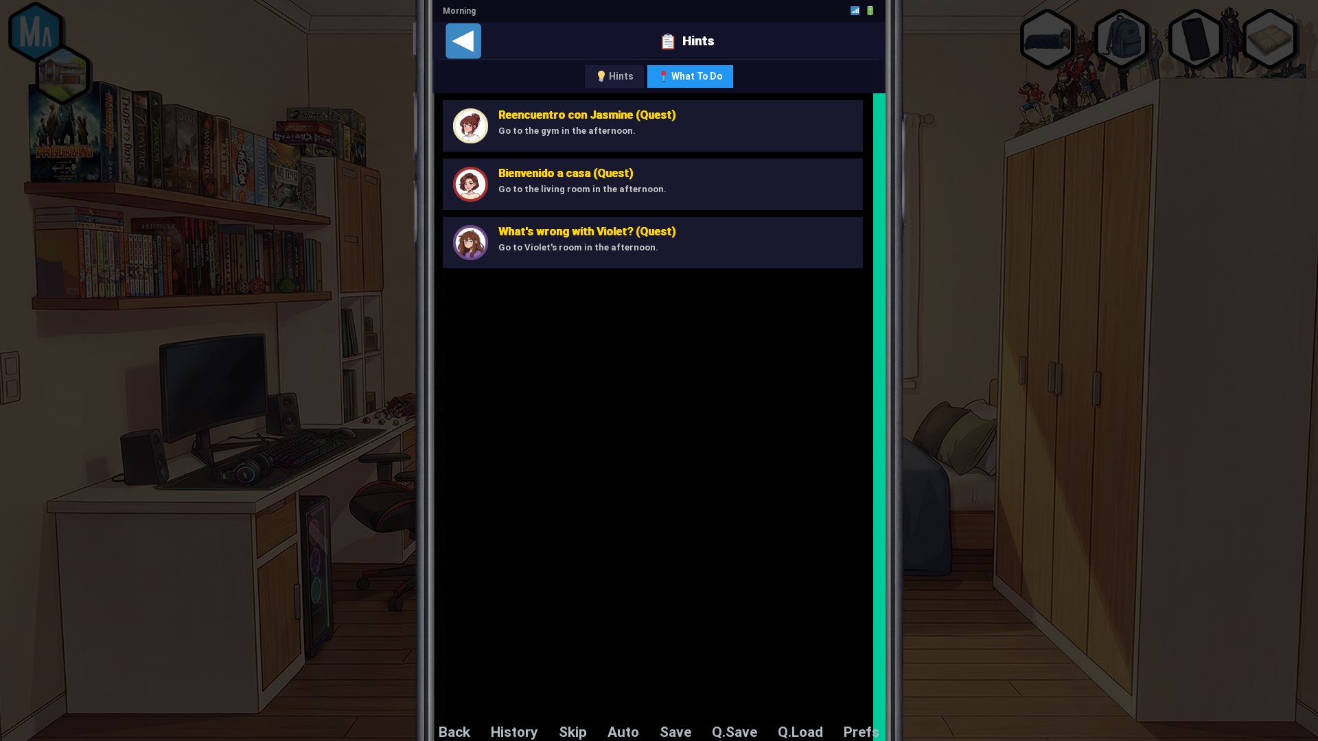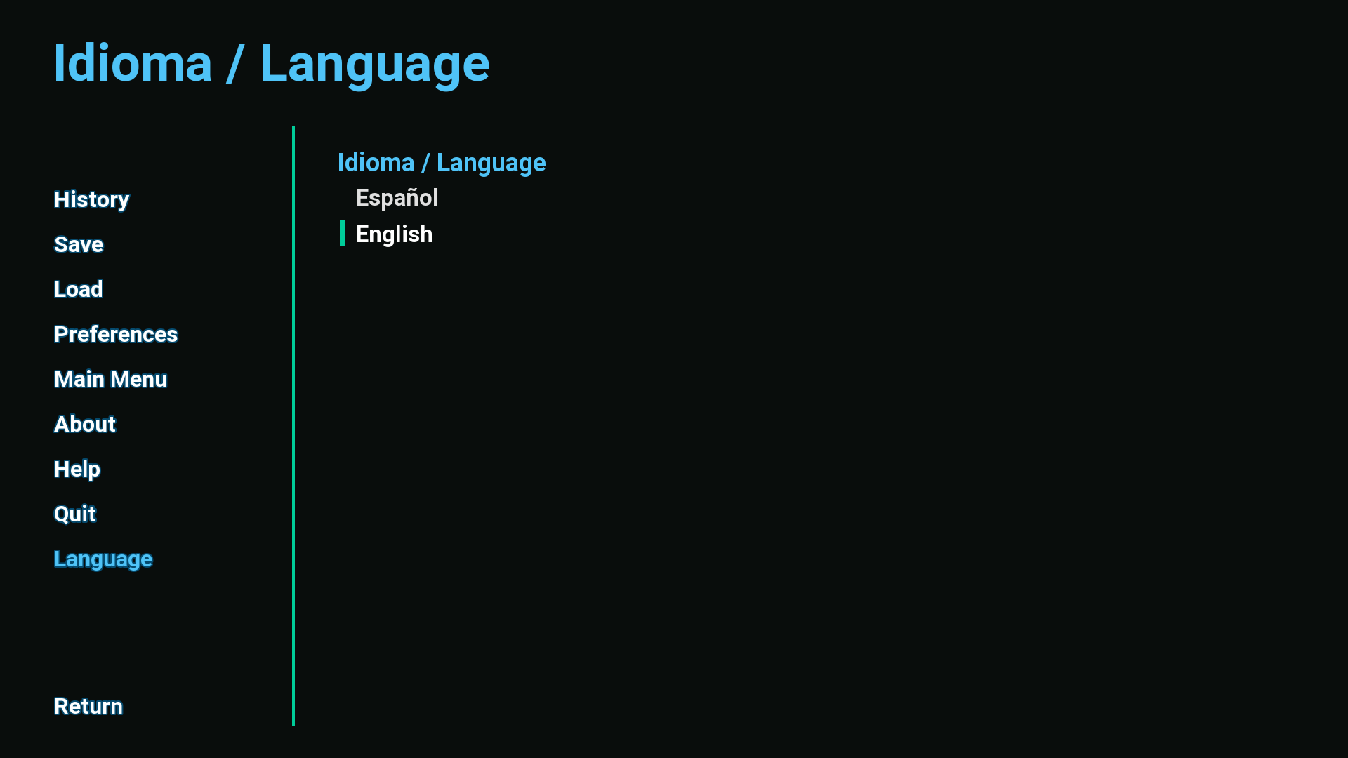
I have a Ren'Py 8.5.2 web build (1920x1080, 16:9) uploaded as an HTML5 project.
On Android phones, roughly the bottom third of the game is cut off and
unreachable. It works fine for some testers and fails for others (3 out of 4
phones), which points at the browser/viewport rather than the game itself.
What I've narrowed it down to
-----------------------------
I tested the exact same build in three ways, on the same phone that shows the
bug:
1. Opening the game's direct URL (html.itch.zone/html/.../index.html), windowed
-> displays correctly, nothing cut off.
2. Same direct URL, then using the game engine's OWN fullscreen option
(Ren'Py's Preferences > Display > Fullscreen)
-> displays correctly, nothing cut off.
3. Launching from my itch.io project page, which on mobile goes fullscreen
-> bottom ~1/3 is cut off.
So the game renders correctly, and engine-level fullscreen works correctly.
The problem only appears with the fullscreen that itch.io applies on mobile.
This matches an open issue on the itch.io tracker:
https://github.com/itchio/itch.io/issues/881
("Wrong fullscreen orientation and size on HTML5 projects on Android browsers")
where the viewport isn't resized to the device's actual screen size, so the
bottom of the game gets cut.
Relevant detail: per the "More embed options for HTML5 games" post, on mobile
games always launch in fullscreen regardless of the embed settings. So I can't
avoid the broken path by turning the fullscreen button off — every mobile
visitor to my page hits it.
Current embed settings
----------------------
- Embed in page / Manually set size
- Viewport dimensions: 1920x1080 (also tried smaller values)
- Mobile friendly: ON, Orientation: Landscape
- Fullscreen button: ON
- Enable scrollbars: OFF
- SharedArrayBuffer: ON
What I've already tried (no change)
-----------------------------------
- Toggling Mobile friendly and the orientation setting
- Turning scrollbars off
- Reducing the viewport dimensions
- Patching the game's index.html: height:100dvh on the canvas (instead of
height:100%), overflow:hidden on html/body, and
user-scalable=no, viewport-fit=cover on the viewport meta tag.
I expected the 100dvh change to fix it, since inside a fixed-height iframe
the canvas can extend behind the browser UI — but it made no difference,
which makes sense if the iframe itself is the wrong size to begin with.
My question
-----------
Has anyone found a workaround for this on the developer side? Specifically:
- Is there an embed configuration that avoids itch.io's mobile fullscreen
behaviour, or makes it size the viewport correctly?
- Is there anything I can do from inside the iframe (JS/CSS in index.html) to
detect and compensate for a viewport that's taller than the visible screen?
- Or is this simply not fixable from the developer side until #881 is resolved?
Any pointers appreciated. Right now my only workarounds are handing out the
direct html.itch.zone link for mobile players, or shipping a native build.